In the general election, I voted for Zöe Franklin (Lib Dems) not Angela Richardson (Conservative), and was happy when Franklin won, but to be fair I think Richardson took her responsibilities as a constituency MP seriously. A few months ago I wrote to Richardson to express puzzlement at some of the NHS’s guidance on preventing airborne diseases spreading. Richardson then forwarded it to the office of the then minister Maria Caulfield, who replied. The reply is at the bottom of this post as a pdf.
Apparently crazy advice from the NHS
Unfortunately there is currently a resurgence of measles in the UK. Measles is notoriously highly infectious amongst those who are not vaccinated. So it makes sense that the NHS should offer guidance on how to minimise measles transmission. But this guidance contains a recommendation which is, on the surface, just bizarre.
Travis Kelce illustrating how to spread airborne diseases
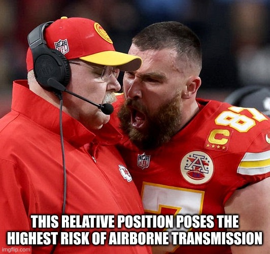
The Kansas City City Chiefs went on to win the 2024 Super Bowl, but part of the way through the match both the team as a whole and their player Travis Kelce were up against it. Under huge pressure, Kelce gave the Chiefs’ coach, Andy Reid, both barrels from up close – see image above. Kelce apologised afterwards, and the coach seemed relatively unbothered. The incident is sufficiently famous that it has spawned memes, and a meme generator. My attempt at a meme is above: Kelce and Reid illustrate almost perfectly the ideal setup for one person, here Kelce, to transmit an airborne disease such as COVID-19 or flu, to another person, here Reid.
Unknown unknowns and Breathtaking

In the first episode of Breathtaking – ITV’s drama about the NHS in the COVID-19 pandemic – there is a scene where they suspect a patient may have COVID-19. They put the patient in a small side room, and try but fail to order a COVID-19 test. This is early in the pandemic, when tests were being rationed by the NHS/government. They suspect he has COVID as his symptoms are unusual, but are consistent with what they know about COVID. The episode shows the staff being, understandably, stressed by having to share a small room with someone who may or may not have a new, potentially fatal, disease.
Are there Elon Musks of COVID infectiousness? If so are they superspreaders?

Above is a plot of estimated viral load for a sample of people infected with COVID-19. It is a probability (density) distribution, so the x axis is how much virus is in the saliva of the person, and the height of the points (y axis) tells you how many people have that load. Note that there are two studies, one by Viloria Winnett and coworkers and one by Takatsuki and coworkers, and that both found an enormous range of amounts of virus. Many orders of magnitude in both cases. The units are estimated numbers of copies of the viral RNA gene, per millilitre (ml). The points are the data while the lines are my power law fits, in both cases the exponents are close to minus one. The probability of having a viral load v scales approximately as one over v.
Power laws and COVID Part Three: Roughly linear relationship between “viable virus” and the standard qPCR test?
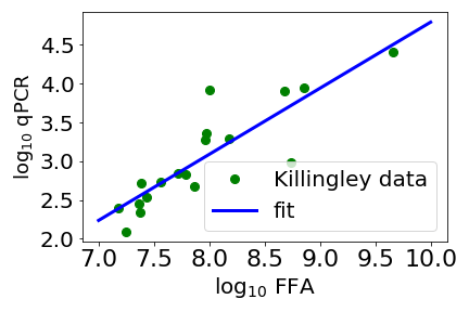
Above is a scatter plot of data from Killingley and coworkers (green circles). The x axis is a measure of how much “viable virus” there is mucus taken from the throat of a person infected with SARS-CoV-2. Here viable virus is measured by a focus forming assay (FFA)*. The y axis is a PCR (polymerase chain reaction) measurement, this measures the amount of a fragment of the virus’ genome. Note that both axes are the log (base 10) of the measurement. The straight line is a fit with an exponent a bit less than one. With an exponent close to one, the amount of viable virus, as measured by FFA, is pretty much proportional to the PCR measurement.
Power laws and COVID Part Two: Power law distribution of infectiousness?

In the previous post I suggested that data from the NHS’s COVID app was consistent with a power law distribution of the rates at which an infected person infects a susceptible person. If this is true, then can we understand why there should be a power law distribution of rates of COVID transmission? Transmission of infectious diseases is very complex, it is between two human beings – and we are very complex – in a complex variable environment – small and large rooms with good and bad ventilation and with the two people close or far apart. So there are many possible candidates for source of the power law in transmission rates. One is plotted above.
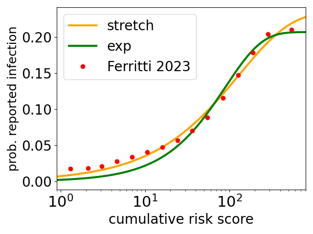
Power laws and COVID

Above is a plot of the data of Ferretti and coworkers (green circles and crosses*) on the probability of infection with COVID, as a function of exposure, as measured by data from the NHS COVID-19 app. Note that it is on a log-log scale. The blue line is a power-law fit*, with best fit exponent β = 0.48, i.e., the probability of infection almost scales as the square root of the exposure (that would be β = 1/2). For comparison there is also a line (orange) showing what linear behaviour (β = 1) would look like. Clearly the data look a long way away from linear. And indeed Ferretti and coworkers do fit power laws and also get good fits, and a similar exponent.
Teaching elementary machine learning

Next semester I will be teaching a computational modelling course, to second-year physics undergraduates. The projects are mainly standard computational physics projects, like computing the orbits of the planets. Currently there is no machine learning (ML) project. Given how topical ML is, and how many jobs there in ML, this is perhaps a bit of an omission. I am working on fixing this, by developing a simple supervised learning ML project: Predicting probabilities of developing heart diseases using logistic regression.
Learning from the NHS COVID-19 app
The UK government introduced the NHS COVID-19 app in Autumn 2020, and it ran throughout 2021, before being abandoned later. It used mobile phone’s Bluetooth so that one phone running the app knew which other phones running the app were close by, and how long for. This informaton was used to alert users if they had been in contact with another app user who tested positive for COVID-19. I think the idea was that if say user A reported testing positive for COVID-19 then the app would talk to a central database that held data on which phones (which also had the app) had been close to A’s phone (for longer than a threshold time). Then the owners of those phones would be asked to isolate. The app also provides a lot of data on transmission, as if say user B reports testing positive shortly after being in contact with A then it is quite likely (although far from certain) that A infected B. This data has now been analysed by Ferretti and coworkers.
