The increase in CO2 is obvious, Keeling’s 1st measurement in March 1958 was of 317 ppm CO2. Here ppm = parts per million, so 300 ppm is 3 in every in 10,000 molecules in the Earth’s atmosphere being CO2. Keeling spent his whole career on this measurements. When he died in 2007 the amount of CO2 had risen to over 380 ppm. Today it is over 420 ppm.
Also clear from the plots is a wiggle in the data. This is an annual variation on top of the increasing trend. Keeling’s pioneering measurements found that in the northern hemisphere (where Mauna Loa is) that CO2 drops a bit in summer – due to all that photosynthesising in the summer sunshine – and increases a bit in winter (less photosynthesising). This gives the annual wiggle, which is clear in the data. But the wiggle is small, it is clearly dwarfed by the increase over the last 70 years.
So much for the data, what about modelling it? The data is what is called a time series, i.e., a set of measurements at successive times. Time series arise all over the place, in science, engineering, economics, business, etc, and so there are very standard models used for time series. Nowadays with powerful Python libraries like statsmodels and help from Claude etc with the coding (Claude, Gemini, etc work great for very standard/common problems like this), it is easy and quick to start modelling time series data.
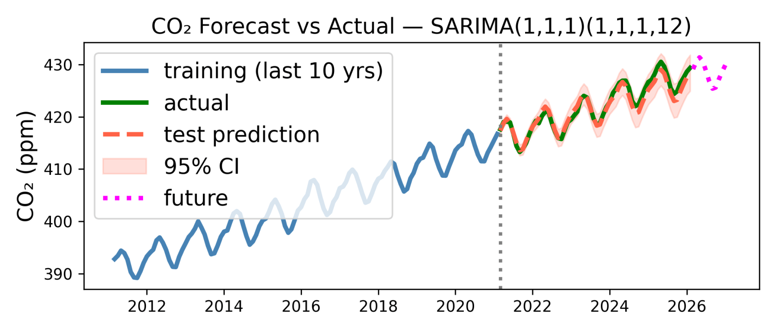
My first attempt at time series modelling is above, although Claude deserves most of the credit***. It shows 15 years of data, from 2011 to February this year. The first 10 years of data (in blue, to left of dashed vertical line) is used to fit a model, and the last 5 years of data (green) are used to test the model prediction. The model’s prediction is shown as the red dashed curve. As you can see the prediction is pretty good, the errors (difference between green and red dashed curves) are only around 1 ppm. The shaded region shows the 95% confidence interval of the prediction, and the actual measurements are within that.
So it looks like both the increase in CO2 due to our oil/coal/gas burning, and the annual variation are sufficiently regular that they are easy to predict. I have even extrapolated the prediction 12 months past the last measurement in the data set (Feb 2026), to the period March 2026 to Feb 2027. This is the magenta curve, and the model predicts a mean CO2 of 429 ppm for March 2026 to Feb 2027. I can come back to this in a year and see how accurate it is.
The model used to make the prediction is very standard. It is SARIMA: Seasonal Autoregressive Integrated Moving Average. This is quite a mouthful, it is best to break it down. SARIMA builds on the simpler model called ARMA: Autoregressive Moving-Average.
ARMA is a model for a time series that is just noise plus a mean value that is not changing. To estimate the ith term I think ARMA does two things: The first is the autoregressive, AR part of ARMA. Autoregressive seems to a very fancy word for assuming that the ith value is like the previous value. The simplest AR model just assumes that the ith value is the same as the (i−1)th value. You can also go beyond this and assume that ith value is a weighted sum of the (i−1)th and the (i−2)th points, etc. All these models just use previous points to predict future ones.
If there is a trend in the data, but no periodic oscillation, then the model needs to be generalised from ARMA to ARIMA, where the extra I is for Integrated. This, I think, assumes that with a trend, the average value is moving up (or down) but the difference between successive points should satisfy the criteria required for ARMA, i.e., being some constant mean value plus random noise. This should be reasonable if successive points are close enough together that variation between them can be described by a straight line of constant slope. So I think ARIMA takes the difference between successive points, applies ARMA to the set of these differences, and then integrates the result to get the model prediction. This integration gives the I in ARIMA.
If in addition to the trend there is also a periodic variation, then we need to generalise further, from ARIMA to SARIMA, where the S is for Seasonal, i.e., periodic. Simply speaking I think SARIMA works as follows. SARIMA applies ARIMA to get rid of the long term trend and then in addition to using the previous point or two, i.e., points i − 1 and maybe i − 2, to predict the value of the ith point, it uses the point one period ago, i.e., it adds in a term to use the previous, say, June CO2 value, to predict the CO2 value next June, and it this that allows it to reproduce the periodic variations.
The CO2 data has both an upward trend, due to us, and an annual variation, due to Earth orbiting the sun and plants. So we need a full SARIMA model to account for both the trend and the periodic oscillation. To be honest, as a time-series newbie I am still learning how this works, Claude can write code very easily but working out what it does is inevitably slower….
But I like a pretty plot, and I like the one up top very much. Data analysis is fun, something unfortunately lost on climate deniers who are sadly blind to the fact that anyone (you!***) could make a decent stab at predicting next year’s – on average higher CO2 levels – armed only with publicly available data and a little Python code.
* As Bourzac explains, so long as a volcano is dormant it is a good place to measure CO2. It is from human activities (which produce CO2) and there is little (photosynthesising) plant life there. So relatively far from sources and sinks of CO2.
*** The analysis is all done in a Google Colab notebook, so to reproduce the analysis just download it and the NOAA data (link just above) in csv format. I should say that using only data up to 5 years ago to predict the next year’s CO2 is not optimal, to get the best prediction you should fit on all the data you have. This is easy to do, I was just a bit lazy.
