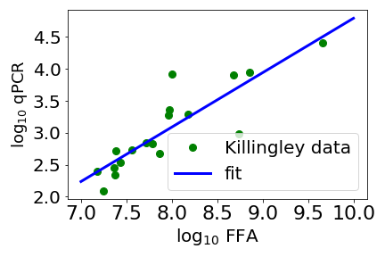
Above is a scatter plot of data from Killingley and coworkers (green circles). The x axis is a measure of how much “viable virus” there is mucus taken from the throat of a person infected with SARS-CoV-2. Here viable virus is measured by a focus forming assay (FFA)*. The y axis is a PCR (polymerase chain reaction) measurement, this measures the amount of a fragment of the virus’ genome. Note that both axes are the log (base 10) of the measurement. The straight line is a fit with an exponent a bit less than one. With an exponent close to one, the amount of viable virus, as measured by FFA, is pretty much proportional to the PCR measurement.
Given how messy biology is, this simple proportionality relationship surprised me. If this holds generally then the simpler qPCR looks like a very good proxy for the amount of infectious disease. Not only this but as the relationship is close to linear then if two people have say double the qPCR score then they should have close to double the infectious virus in their system, something it is very useful to know if you want to use qPCR data to predict infectiousness.
This brings me to the second point of this post, which is that the fit in the plot above is mine. Killingley and their over 20 coworkers did not fit a straight line to the data. This is such an extreme example of the difference between biomedical researchers and medical doctors (like Killingley and coworkers), and physicists (like me) that it does my head in. The work in the paper took a team of over 20 people, and could easily have taken 10 or more person years and over a million pounds of UK taxpayer’s money. They worked very hard to get a lot of great data, some of which pretty obviously falls on a straight line.
And then did not fit a straight line to this data!** Starting early Feb I am teaching a computational modelling course to physics students, and pretty much the first thing I do when students get some data, is help them fit to it, eg fit a straight line to the data. I find it bizarre that the authors of this work were apparently not interested in quantifying the relation between their measure of how much infectious virus there is, and perhaps the simplest method (qPCR) we have for assessing a viral load.
In the 1950s CP Snow (relatively) famously talked about “intellectual life” splitting into “two cultures”, meaning science and humanities. In the 2020s this dramatically underestimates the problem, science itself seems to have at least two and possibly more cultures, and this is unfortunately hindering research into diseases such as COVID, flu, measles and TB.
* I am not an expert here and the paper gives few details but I think the idea is that the mucus is used to try and infect cells. Infections show up as patches of dying/sick cells – foci – and so the more patches of sick cells, the higher the estimated concentration of infectious virus.
** Instead Killingley and coworkers estimated p values, a statistical measure so abused and misunderstand that the American Statistical Association (ASA) in effect issued a statement of concern.
