The UK government introduced the NHS COVID-19 app in Autumn 2020, and it ran throughout 2021, before being abandoned later. It used mobile phone’s Bluetooth so that one phone running the app knew which other phones running the app were close by, and how long for. This informaton was used to alert users if they had been in contact with another app user who tested positive for COVID-19. I think the idea was that if say user A reported testing positive for COVID-19 then the app would talk to a central database that held data on which phones (which also had the app) had been close to A’s phone (for longer than a threshold time). Then the owners of those phones would be asked to isolate. The app also provides a lot of data on transmission, as if say user B reports testing positive shortly after being in contact with A then it is quite likely (although far from certain) that A infected B. This data has now been analysed by Ferretti and coworkers.
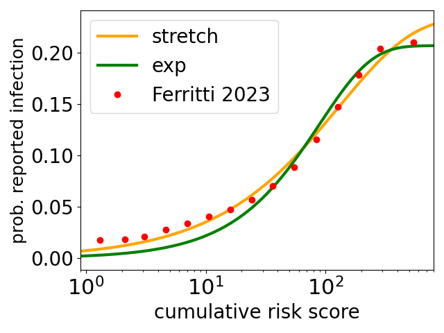
Their data are the red circles in the plot above. The y axis is the probability that an app user reported becoming infected, in a period of a few days after being exposed, to what their phone app estimates as the cumulative risk score plotted on the x axis. The cumulative risk score is such that it equals 1 for an exposure of 15 minutes at a distance of 2 metres*.
At the threshold risk of 1, for a 15-minute contact, the infection probability is around 2% . For a full 24 hours in contact, the app-estimated risk is essentially 100 times higher and the infection probability is five times higher at around 10%. Note the logscale on the x axis, the range of app-estimated risks of infection is very broad, ranging from 15 minute contacts to people spending days together – presumably these contacts are between people who live together.
The green and orange curves are fits** to the data of Ferretti and coworkers. The green curve is an exponential function (here this is the assumption of Poisson statistics for infection a la Wells Riley) times a fraction f. The orange curve is a stretched exponential times a fraction f, and it does a much better job at low infection risks. The stretched exponential times a fraction f function is
probability of infection = f ( 1 – exp[-(risk/scale)β] )
Two points. First on the fraction f. The probability of reported infections seems to be plateauing at large risks. In part this may be an artifact due to users becoming infected and not reporting it, either because the infection is essentially asymptotic and they don’t realise, or because they deliberately don’t report it. It may also be some combination of some infected people being almost completely non-infectious, and some people being almost immune to infection. In any event, the fits give best estimates that only 21% (exponential fit) or 23% (stretched) of contacts will result in transmission, however long/risky they are.
Second, the exponential function is a very poor fit at low risks, it greatly underestimates the probability of reported infection there, while the stretched exponential is much better there. At low risks the exponential predicts a linear increase of infection probability and that seems clearly wrong here. While at low risks the stretched exponential has the form (risk)β, i.e., it is a power law form, and here the best fit exponent β = 0.71. As it is less than one this gives a slower increase at lower risks, which is what the data is doing.
I think this sublinear increase at low risks may be quite common for infectious diseases, but it disagrees with the standard (very simple) model for airborne transmission of disease – the Wells-Riley model – which, because it is based on Poisson statistics, predicts a linear increase at low doses***.
In the 1960s Proschan pointed out that heterogeneity plus Poisson statistics gives rise to a sublinear variation in probability****, which here is a sublinear increase in the probability of infection.
The underlying model of Proschan, applied to this problem, is that the NHS COVID-19 app data is for a very large number of pairwise contacts between infected and susceptible people. We assume that transmission is for each pair a random event with standard Poisson statistics, but each pair has its own scale for how the probability of transmission varies with app-estimated risk. In other words, for different pairs of interacting infectious and susceptible people, the risk of say, a 1 hour contact, is different. This could be for many reasons, occurring in a well/badly ventilated room, one or both wearing a mask, etc.
This then leads directly to sublinear behaviour, as Proschan showed. The basic idea is that if you look at risks below, say, 10, then the high risk contacts are contributing a lot more to the infections, causing the slope of rising probability of infections to be high, while at higher risks the lower risk contacts are contributing more to the infections, meaning the slope is lower. This decreasing slope means the probability of infection is a sublinear function of app-estimated risk.
This argument of Proschan, is very general. He applied it to air-conditioning units in Boeing airliners, but it may well apply here to COVID-19 infections. And the sublinear behaviour has consequences, for example for how much mitigation strategies such as masks and room ventilation, reduce COVID-19 transmission.
* The algorithm estimates risk as follows. It is evaluated in 30 minute windows, in each window
Risk score = proximity score * duration within 30 minute window * infectiousness score
The proximity score is 1 if Bluetooth estimates a distance less one metre, and above that it decreases as one over the square of the estimated distance. The infectiousness score is either 1 or 2.5, depending on when the exposure occurred relative to A testing positive. The risk score is normalised so that it is 1 for exposure for 15 minutes at 2 metres, to a person with an infectiousness score of 1. This is around the typical threshold for alerting the user that they have been in contact with an infectious person.
** The bestfit risk scale parameters for the exponential and stretched exponential fits are 90 and 131, respectively, and the exponent in the stretched exponential β = 0.71.
*** A more complex model of dose-response, used by Charles Haas and coworkers, also gives a linear behaviour at low probabilities of infection.
**** Sublinear increases have been modeled for decades in the field of applied stats called survival analysis, the field Proschan worked in. Here the idea is that one minus the probability of infection at a particular app-estimated risk is the probability that you survive that estimated risk without being infected.
