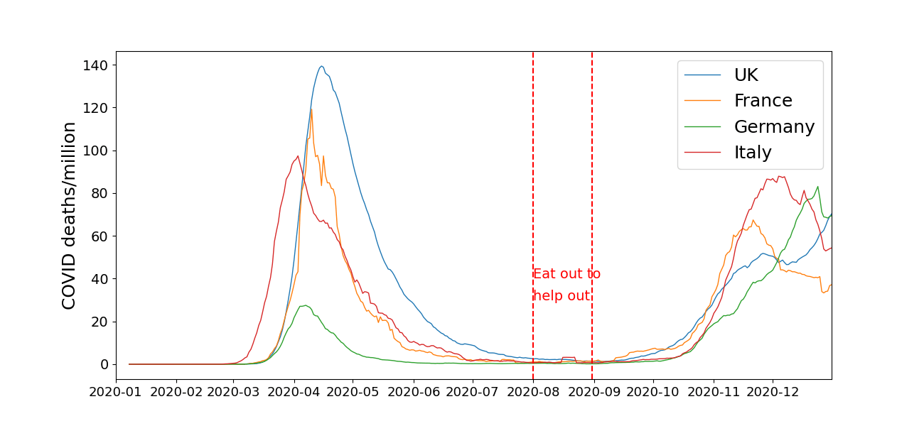
The graph above is a bad graph** – it is a replot (as original will be copyright of The Spectator) of a graph in The Spectator article Did Eat Out to Help Out rekindle Covid? A look at the data, by The Spectator‘s editor Fraser Nelson. Rishi Sunak’s Eat out to help out scheme ran for the month of August 2020, and in the article Fraser Nelson (a politics and history graduate) decides to “look at the data” and tell professional epidemiologists why they are analysing this epidemiological data incorrectly. This demonstrates either impressive self-confidence or eye-brow-raising-arrogance, depending on how sympathetic you are to Mr Nelson.
But anyway, let’s take a look at Nelson’s “look at the data”. The first thing I notice is that the graph in the original article and as roughly copied above, makes it almost impossible to see clearly what is happening in August and September 2020. The plot shows deaths, which are a lagging indicator, it typically takes weeks or a month, from becoming infected with COVID-19 to death. So to look at the immediate effects of Sunak’s scheme, you need to look at deaths in August and September. Nelson has chosen scales for the graph that make it very hard to look at the data in this period.
So let’s change the scales, then we get:
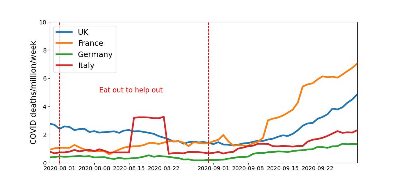
This zooms in on the period of interest**. Now we can see that at the start of Eat out to help out, at the start of August, there is if anything, a slight downward trend in deaths. However, from about a week into September – when the deaths from any infections caused by Eat out to help out would be occurring, the trend is clearly up.
Another problem with the original graph that I reproduced in the copy up top, is that the y-axis label is wrong. By cross-checking I am pretty sure the numbers are deaths per million people in the population per week – Nelson missed the per week bit, while he was looking at the data.
Now, around August 2020 several things were being done and so you can’t easily attribute any change in the mortality to any one of the changes made around this time, such as Eat out to help out. Presumably the increase in deaths from COVID had multiple causes. But see the Wikipedia page for Eat out to help out, for references to studies of the scheme.
The plot also shows the data for a few other European countries. France came out of lockdown in mid-July and the rapid increase in France’s figures may be a result of this. But you would need a proper epidemiologist to try and work that one out, not a politics and history graduate.
* There are various collections of terrible graphs on the internet, eg see here and here, or search “#badgraphs” on Twitter/X.
** There appears to an anomaly in the Italian data in August 2020. This seems unlikely to be real, it may be due to problems collecting data.
